I recently read a good post from Brandon over at ibmacin.com about how he chose which size iPad to use. It not only had some good things to think about when picking a size, but it was also a good reminder about how versatile the iPad is. (For an even more in-depth look at versatility, check out Denny’s post here).
Brandon’s post mentioned the Display Zoom setting for M1-powered (and later) iPads. I had briefly looked at this back when it was introduced in iPadOS 16, but didn’t really spend any time with it. After reading Brandon’s post, I decided to give it a try.
Display Zoom
So, what is Display Zoom? It’s a setting (Settings > Display & Brightness > Display Zoom) that increases the amount of screen space on your iPad by making everything smaller. My 11” iPad Pro has a native screen resolution of 2388 × 1668 pixels. But, changing Display Zoom to More Space makes it appear that the resolution is 2778 × 1940 pixels. For comparison, the larger 12.9” iPad Pro’s native resolution is 2732 × 2048 pixels, so this setting actually gives the 11” iPad Pro a bit more horizontal screen space than the larger one.
Why Zoom?
So, why would you want to turn this setting on? Well, having more screen space can be nice, especially when you’re trying to get some work done. If you use your iPad as your main computer, as I do, then sometimes the smaller screen, compared to a larger laptop, can seem limiting, especially on the 11” iPad Pro (or the 10.9” M1 iPad Air).
With more space, apps can show more information. That might be more text, more photo editing controls, or more spreadsheet rows. Many apps will also take advantage of the extra space and allow what’s called a three column or three pane layout, showing more of a hierarchy of information. For example, the Mail app can show the mailbox list, the list of messages, and the currently selected message all on screen at once. It’s similar for many others.
Multitasking is another use where more space makes a big difference. Having two apps open in Split View means each app can show more information. On the 11” iPad Pro with default display settings, some apps in Split View show an iPhone-style layout instead of a regular iPad layout. With more space, that’s not an issue. And, if you’re using Stage Manager, it’s much nicer to have more space to arrange your app windows.
Comparing
While it sounds as if more space is a win all around, I did notice that some apps seemed too small for my aging eyes. This wasn’t always the case, and if I held the iPad as a tablet, where it was closer to my face, it was better. But when working on the Magic Keyboard, where the iPad is further away, many apps were harder to read.
I decided to do some comparisons of apps I regularly use, and not only look at the size on screen, but also how much extra information was displayed. I wanted to decide if more space was worth more eye strain.
First up, I looked at the Mail app. Here’s a look with the default setting:
Not bad. The list of messages is shown as well a good view of Jason’s email (by the way, Jason has a great blog you should check out.).
When switching to More Space, not much changes:

This is interesting. There is more content vertically, but Jason’s message shows the same text horizontally. There is a lot of white space around the message, essentially keeping it the same width as before. Not all emails behaved this way, but many did.
As I mentioned above, Mail allows a three-pane layout when it has enough space. Here is what that looks like:

This is more interesting still. All three panes (mailboxes, messages, and the selected message) are displayed, which is nice. And, in this case, Jason’s message has been reformatted. The text is somewhat larger, the white space is gone, and more text is displayed horizontally, and even more vertically.
Notes
Here is the Notes app with the notes list showing at the default setting:

Not bad. There is quite a bit of text showing and it’s easy to read.
Here’s the same note without the sidebar:
There’s quite a bit more room for text and it looks good.
OK, so how much more text is displayed with More Space turned on?

There is a little more text horizontally, but quite a bit more vertically, which is good.
Here’s the same note without the sidebar:

There are a few more words per line, but many more lines in that third paragraph.
Finally, here is the three-pane view:

Here there are actually fewer words on a line than in the default display mode, but there is the added benefit of seeing the folder list in addition to the notes list and the note itself.
Ulysses
I use the Ulysses app to do my writing. It’s a wonderful app that I’ve been using for many years. I highly recommend it.
Here is Ulysses with its Sheet List visible and a Sheet displayed with the default display setting:

And here it is without the Sheet List:
Interestingly, here there is no change in the amount of text displayed. Removing the sidebar just adds extra margins around the text.
Now, what about with More Space?


Now, this is fascinating and not what I expected. Even with More Space turned on, the text layout is the same horizontally. There are definitely more lines of text vertically, as expected, but I would have thought there would be longer lines of text as well.
Here is Ulysses in the three-pane view:
Here there are shorter lines of text, but because of the extra vertical space, about the same amount of text is displayed as in the default display mode, with the added benefit of the sidebar.
Safari
Finally, let’s take a look at Safari, as I think this is one of the more compelling cases for More Space. Many web pages just seem better when they have more space to lay out their content.
First, here is NASA’s site with the default display mode:
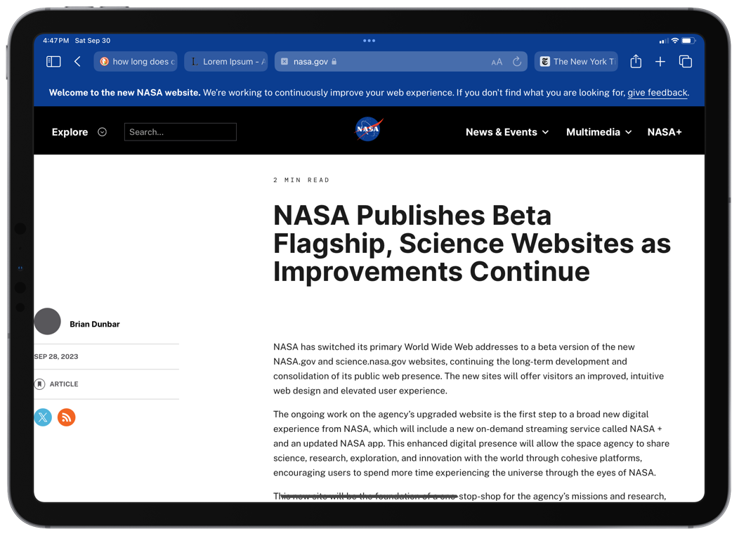
Not a great layout to start with, as there is a lot of white space between the column on the left and the main article text.
Here’s the same page with More Space turned on:
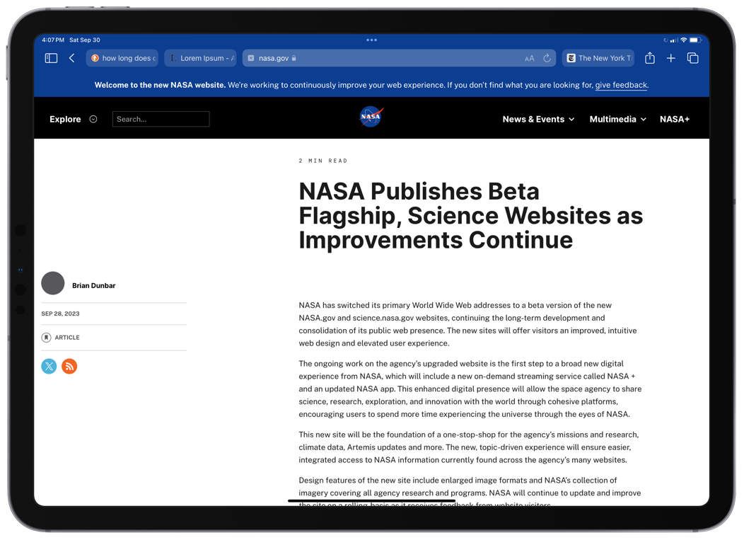
The text of the article has the same layout as the default display mode, and there is even more space between the column on the left and the article. More of the article is displayed, however, since there is more vertical space.
Here is The New York Times home page with default display settings:
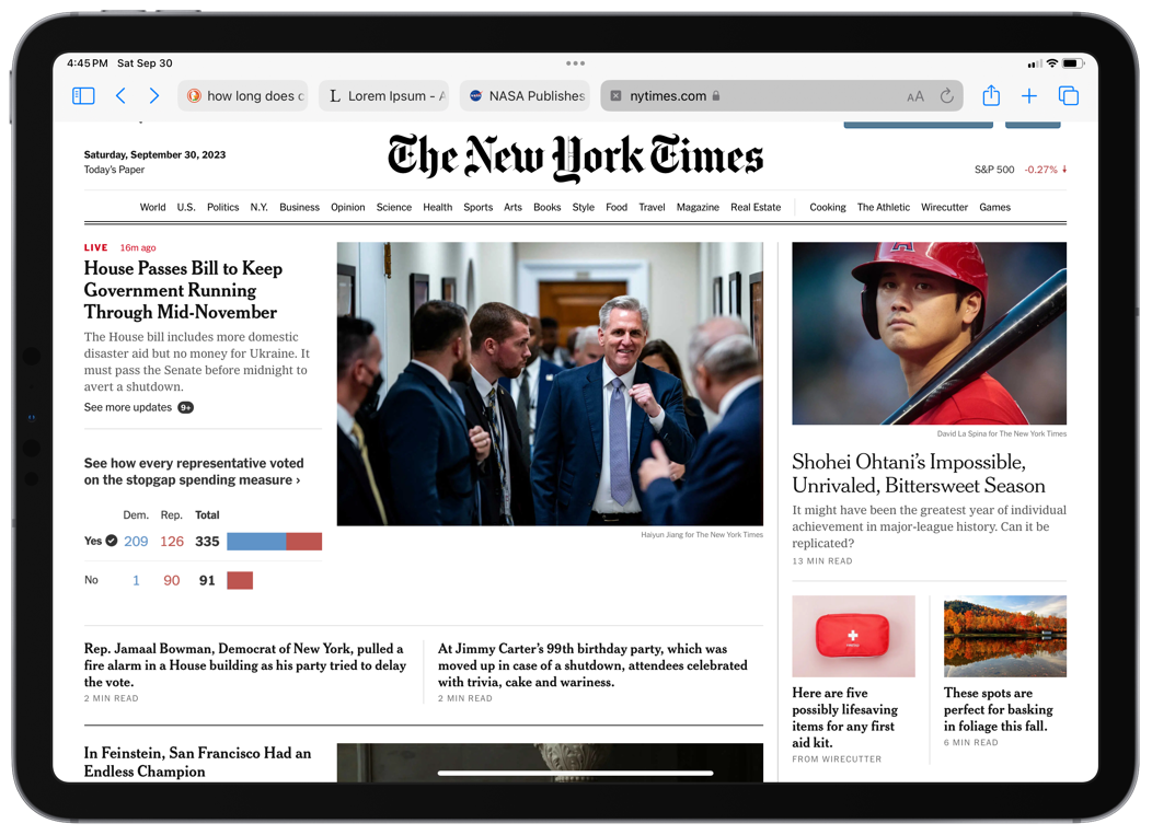
They fit a decent amount on the page, and have a nice layout. Maybe NASA should take a look to get some ideas.
Here’s the same page with More Space:
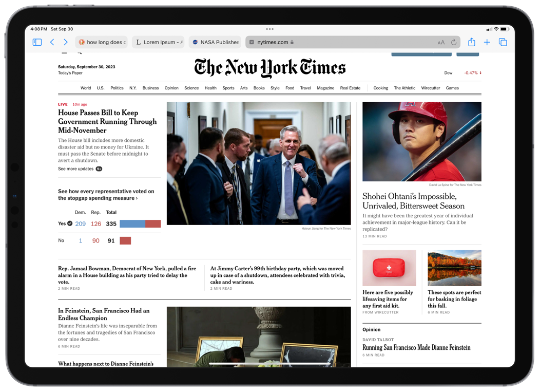
This is essentially the same layout, with more words fitting on lines in some headlines, and, again, more of the front page showing vertically.
Perhaps these aren’t the best examples of web pages. I did take a look at my bank’s site, and liked how much more information I could see with More Space turned on. Sorry, but I would rather not post a screenshot of that here. After looking at quite a few more sites, my experience is that most web pages take good advantage of the extra space.
Conclusions
So what does all this mean for me? I do like the ability to get more screen space on my 11” iPad. I can almost experience the 12.9” iPad, in a smaller package, minus some vertical space.
While working on this post, there were times when I really liked having the extra space. When I do screenshots, for example, I often have Ulysses and the Files app open in Split View, and the extra space was helpful.
I also tried out Stage Manager with the More Space setting, and it was definitely better to use, as the extra room improved managing windows. But I still feel the 11” screen is too small for Stage Manager. I much prefer using an external display if I need multiple windows.
In the end, I’m not convinced that this setting is for me. In most of my day-to-day use, I found the More Space option makes things too small, and I have a harder time reading what’s on the screen. Also, the change in apps was frequently not as significant as I thought it would be. Having more space is useful, and apps generally do a good job with it, but I didn’t find that to be worth the eye strain.
One thing’s for sure, this exercise has really got me thinking about that 12.9” iPad Pro again. If I could have the extra space (with even more vertical space), without the smaller size text, that would be a big win! And I think Stage Manager would be better as well. I’d assume that even on the larger iPad, turning More Space on would make the text smaller than I’d like. But the default offers plenty more room compared to my 11”.
Maybe when it’s time for me to upgrade, I’ll make the jump to the larger iPad. I had a hard time deciding between the two when I bought this one, and I can see the same struggle happening again.
What do you think? Have you tried More Space? Is it working for you?

Great comparisons, Rob. Good details with screenshots. I have pretty much the same conclusions.
I haven’t used More Space much since it makes text a bit too small. Buy I do love that it gives persistent 3-pane views like what’s default on the 12.9”. It’s nice to see more navigation areas sometimes along with content.
More Space seems best on an external display with Stage Manager I think. But it’s good to have in a pinch on the 10.9” Air. I sometimes prefer the WordPress CMS in More Space mode, but I mostly just leave things in the default Display Zoom. It keeps things simple and I’m used to it. I will have to keep trying More Space…more. If you keep trying it out, do share any new findings.
Oh, do you always use Safari with the compact tabs? If so, I’d like to know more why you choose that. I really like the aesthetics of it, but at least on my MacBook, I preferred the classic tabs. Maybe I’ll try compact again since I’m on the iPad now.
And thanks for the references! 😊
LikeLiked by 2 people
Thanks, Jason. I agree re: external display. I turned on More Space there and like it a lot. And yeah, I like having the option on the iPad itself for the times it makes a difference, but normally I’ll leave it off.
Yes, I always use compact tabs. I know there was a lot of dislike thrown around when they came out, but I like the smaller footprint and also just how they look. I don’t think I’m giving anything up using them and they work well for me.
Thanks for reading and for the comment.
LikeLiked by 1 person
Excellent post Rob! I turned on More Space immediately and have left it on. I do have the aging eyes problem and have adapted in multiple ways. I tend to adjust the distance of the iPad often anyway and find that keeping it closer generally helps. Also, I find it’s helpful to adjust text size of apps in the Control Center. And I often change text size in Safari, probably once or twice a day as needed but I would do that regardless of the More Space settings.
But even with the 13″ I want as much space as I can get. When Apple offers a larger iPad I’ll definitely be considering it. I would opt for 14″ to 15″ if offered. My last MBP was 14″ which was about perfect for me.
All that said, 80% of the time I’m actually good with just one or two windows on my screen and don’t actually NEED the space. It’s only the 20% of the time that the extra space comes in really helpful. But now that I’ve gotten used to it I couldn’t go back. There are some apps and tasks that I think especially benefit. In my case it’s usually page layout where I want as much as I can see on the layout app but also access to the Files app and often at least one other app. So, 3 apps.
Now I’ll contradict myself and say that something else I’ve noticed is that since I switched over to Stage Manager I tend to keep 3 windows open far more often than needed. It’s a convenience that I’ve come to appreciate. Stage Manager feels like a gradual and subtle mode-shift to a new iPad experience. Not quite a Mac experience but definitely not the simpler iPad experience we’ve all gotten used to for the first 11 years of iPad.
I do think there is a very fine balance in terms of the More Space setting and touch targets. The most evident to me happens to be Safari tabs and the bookmarks bar. Most touch targets in iPadOS and default apps are easy to tap without errors but with Safari I find I’m more likely to get errors. I actually wish the tabs and bookmarks bar were a wee bit larger!
LikeLiked by 2 people
Thanks, Denny.
You make a good point about adjusting text size. I hadn’t thought about doing that per app, as needed. That might be a good compromise.
Your point about Stage Manager being a subtle mode shift is interesting. I could see that happening for me as well if I had the larger iPad. When using my external display I often find more windows open than *needed*. I like the flexibility.
Thanks for reading and the comment.
LikeLike
Rob, you’ve done it again. This was an excellent and well researched post on one of my favorite iPad settings. I really like how you included all of the comparison shots contrasting the two display modes.
As for me, at this point I have gotten used to the more space setting and leave it on 100% of the time now. As I age and my eyesight worsens, I may eventually have to revert back, but for now, the default setting looks wrong to me now. It’s funny how quickly we can adjust and get used to a setting like this when we didn’t even have the option for the first 10+ years on iPad. I think what others have mentioned is a good compromise though, default mode when using the iPad alone, and more space when docked to a display using Stage Manager.
I really hope Apple will continue to work on this feature as it would be so nice to be able to set the resolution to different settings depending on if the iPad is connected to an external display, docked to a keyboard case, or is being used strictly as a tablet. It seems like something Apple could definitely add to iPad OS in the future.
Lastly, I’ll echo you and some of the others from the comments that I too find myself always opening 3 or 4 apps when in Stage Manager on an External Display. I think it’s just that I’m so excited that the option is “there” that I feel the need to open up as many windows as I can haha.
LikeLiked by 1 person
Thanks, Brandon.
I like your idea of letting us choose from several resolutions, especially when tied with an external display. The Mac does this, though offers fewer than it used to. I’d love Apple to add this. I think also having the ability to set this with the Shortcuts app would be so cool. Hmmm, I see a feedback report being generated in my head 😀.
Thanks for reading and your comment!
LikeLiked by 1 person